
-
Social Media Analytics
Social Media Analytics
Why Social Media Matters for Brands
Insights Gleaned from Social Media Platforms
Strengths of Social Media Data
Limitations of Social Media Data
Understanding Social Data
Social Media Platforms: Key Features
Structured and Unstructured-Data
Social Data Mining
Social Data Mining Process
Social Data Mining Techniques
Social Data Mining Challenges
Application Programming Interfaces
How APIs Work
Working with APIs
Endpoints
Twitter (X) API
Twitter (X) API — Securing Access
Twitter (X) REST API in Python
Facebook API
Facebook Graph API
Facebook API — Securing Access
Facebook API in Python
Advantages and Limitations of APIs
Data Cleaning Techniques
Natural Language Processing
Natural Language Toolkit (NLTK)
Social Media Data Types
Textual Data Encoding
Text Processing Techniques
Tokenization
Word Tokenization
Character Tokenization
Sub-Word Tokenization
Stemming and Lemmatization
Stemming
Lemmatization
Stemming and Lemmatization in Python
N-grams, Bigrams, and Trigrams
Applications of N-grams
Applications of N-grams in Sentiment Analysis
Topic Modelling with N-grams
Vectorization
Bag-of-Words
TF-IDF Vectorizer
Facebook Brand Page Analysis
Extracting Insights from Facebook Brand Pages
Facebook — Social Data Analysis Process
Facebook — Data Extraction
Text Analytics
Text Analytics Process
Part of Speech (POS) Tagging
Noun Phrases
Text Data Processing in Python
Word Cloud (FB data) in Python
Time Series Analysis and Visualization of FB Comments
Emotion Analysis
IBM Watson Natural Language Understanding
Accessing IBM Cloud Services
Emotion Analysis Using Watson NLU
Sentiment Analysis
Forms of Sentiment Analysis
Types of Sentiment Analysis
Visual Sentiment Analysis and Facial Coding
Applications of Facial Coding
Sentiment Analysis in Text
Analysis of Behaviours and Sentiments
Sentiment Analysis Process
Sentiment Analysis — Classification
VADER Classifier
Standard Sentiment Analysis
Customised Sentiment Analysis
Model Validation – Confusion Matrix
K-fold Cross-validation
Named Entity Recognition (NER)
NER Process Overview
Stanford NER
Challenges in NER
Stanford NER Implementation in Python
Web Scraping
Web Scraping Techniques
Applications of Web Scraping
Legal and Ethical Considerations
Beautiful Soup
Scraping Quotes to Scrape
Scraping of Fake Jobs Webpage
Scrapy
Scrapy Concepts
Scrapy Framework
Scrapy Limitations
Beautiful Soup vs. Scrapy — A Comparison
Selenium
Topic Modelling
Topic Modelling — Illustration
Topic Modelling Techniques
Topic Modelling Process
Latent Dirichlet Allocation (LDA) Model
Topic Modelling Tweets with LDA in Python
Social Influence on Social Media
Key Forms of Social Influence
Social Influence on Social Media Platforms
Examples of Organized Social Influence
Social Network Analysis
Topic Networks and User Networks
Online Social Networks — The Basics
Analysing Topic Networks
Centrality Measures
Degree Centrality
Betweenness Centrality
Closeness Centrality
Eigenvector Centrality
Use Case — Marketing Analytics Topic Network
Social Network Analysis Process
SNA — Uncovering User Communities
Appendix — Python Basics: Tutorial
Installation — Anaconda, Jupyter and Python
Python Syntax
Variables
Data Types
If Else Statement
While and For Loops
Functions (def)
Lambda Functions
Modules
JSON
Python Requests — get(), json()
User Input
Exercises
Appendix — Python Pandas
Basic Usage
Reading, Writing and Viewing Data
Data Cleaning
Other Features
Appendix — Python Visualization
Matplotlib
Matplotlib — Basic Plotting
NumPy
Matplotlib — Beyond Lines
Analysis and Visualization of the Iris Dataset
Word Clouds
Word Cloud in Python
Seaborn — Statistical Data Visualization
Seaborn Visualization in Python
Appendix — Scrapy Tutorial
Creating a Project
Writing a Spider
Running the Spider
Extracting Data
Extracting Data — CSS Method
Extracting Data — XPath Method
Extracting Quotes and Authors
Extracting Data in Spider
Storing the Scraped Data
Pipeline
Following Links
Appendix — HTML Basics
HTML Tree Structure, Tags and Attributes
Tags
Attributes
My First Webpage
- New Media
- Digital Marketing
- YouTube
- Social Media Analytics
- SEO
- Search Advertising
- Web Analytics
- Execution
- Case — Prop-GPT
- Marketing Education
- Is Marketing Education Fluffy and Weak?
- How to Choose the Right Marketing Simulator
- Self-Learners: Experiential Learning to Adapt to the New Age of Marketing
- Negotiation Skills Training for Retailers, Marketers, Trade Marketers and Category Managers
- Simulators becoming essential Training Platforms
- What they SHOULD TEACH at Business Schools
- Experiential Learning through Marketing Simulators
-
MarketingMind
Social Media Analytics
Social Media Analytics
Why Social Media Matters for Brands
Insights Gleaned from Social Media Platforms
Strengths of Social Media Data
Limitations of Social Media Data
Understanding Social Data
Social Media Platforms: Key Features
Structured and Unstructured-Data
Social Data Mining
Social Data Mining Process
Social Data Mining Techniques
Social Data Mining Challenges
Application Programming Interfaces
How APIs Work
Working with APIs
Endpoints
Twitter (X) API
Twitter (X) API — Securing Access
Twitter (X) REST API in Python
Facebook API
Facebook Graph API
Facebook API — Securing Access
Facebook API in Python
Advantages and Limitations of APIs
Data Cleaning Techniques
Natural Language Processing
Natural Language Toolkit (NLTK)
Social Media Data Types
Textual Data Encoding
Text Processing Techniques
Tokenization
Word Tokenization
Character Tokenization
Sub-Word Tokenization
Stemming and Lemmatization
Stemming
Lemmatization
Stemming and Lemmatization in Python
N-grams, Bigrams, and Trigrams
Applications of N-grams
Applications of N-grams in Sentiment Analysis
Topic Modelling with N-grams
Vectorization
Bag-of-Words
TF-IDF Vectorizer
Facebook Brand Page Analysis
Extracting Insights from Facebook Brand Pages
Facebook — Social Data Analysis Process
Facebook — Data Extraction
Text Analytics
Text Analytics Process
Part of Speech (POS) Tagging
Noun Phrases
Text Data Processing in Python
Word Cloud (FB data) in Python
Time Series Analysis and Visualization of FB Comments
Emotion Analysis
IBM Watson Natural Language Understanding
Accessing IBM Cloud Services
Emotion Analysis Using Watson NLU
Sentiment Analysis
Forms of Sentiment Analysis
Types of Sentiment Analysis
Visual Sentiment Analysis and Facial Coding
Applications of Facial Coding
Sentiment Analysis in Text
Analysis of Behaviours and Sentiments
Sentiment Analysis Process
Sentiment Analysis — Classification
VADER Classifier
Standard Sentiment Analysis
Customised Sentiment Analysis
Model Validation – Confusion Matrix
K-fold Cross-validation
Named Entity Recognition (NER)
NER Process Overview
Stanford NER
Challenges in NER
Stanford NER Implementation in Python
Web Scraping
Web Scraping Techniques
Applications of Web Scraping
Legal and Ethical Considerations
Beautiful Soup
Scraping Quotes to Scrape
Scraping of Fake Jobs Webpage
Scrapy
Scrapy Concepts
Scrapy Framework
Scrapy Limitations
Beautiful Soup vs. Scrapy — A Comparison
Selenium
Topic Modelling
Topic Modelling — Illustration
Topic Modelling Techniques
Topic Modelling Process
Latent Dirichlet Allocation (LDA) Model
Topic Modelling Tweets with LDA in Python
Social Influence on Social Media
Key Forms of Social Influence
Social Influence on Social Media Platforms
Examples of Organized Social Influence
Social Network Analysis
Topic Networks and User Networks
Online Social Networks — The Basics
Analysing Topic Networks
Centrality Measures
Degree Centrality
Betweenness Centrality
Closeness Centrality
Eigenvector Centrality
Use Case — Marketing Analytics Topic Network
Social Network Analysis Process
SNA — Uncovering User Communities
Appendix — Python Basics: Tutorial
Installation — Anaconda, Jupyter and Python
Python Syntax
Variables
Data Types
If Else Statement
While and For Loops
Functions (def)
Lambda Functions
Modules
JSON
Python Requests — get(), json()
User Input
Exercises
Appendix — Python Pandas
Basic Usage
Reading, Writing and Viewing Data
Data Cleaning
Other Features
Appendix — Python Visualization
Matplotlib
Matplotlib — Basic Plotting
NumPy
Matplotlib — Beyond Lines
Analysis and Visualization of the Iris Dataset
Word Clouds
Word Cloud in Python
Seaborn — Statistical Data Visualization
Seaborn Visualization in Python
Appendix — Scrapy Tutorial
Creating a Project
Writing a Spider
Running the Spider
Extracting Data
Extracting Data — CSS Method
Extracting Data — XPath Method
Extracting Quotes and Authors
Extracting Data in Spider
Storing the Scraped Data
Pipeline
Following Links
Appendix — HTML Basics
HTML Tree Structure, Tags and Attributes
Tags
Attributes
My First Webpage
- New Media
- Digital Marketing
- YouTube
- Social Media Analytics
- SEO
- Search Advertising
- Web Analytics
- Execution
- Case — Prop-GPT
- Marketing Education
- Is Marketing Education Fluffy and Weak?
- How to Choose the Right Marketing Simulator
- Self-Learners: Experiential Learning to Adapt to the New Age of Marketing
- Negotiation Skills Training for Retailers, Marketers, Trade Marketers and Category Managers
- Simulators becoming essential Training Platforms
- What they SHOULD TEACH at Business Schools
- Experiential Learning through Marketing Simulators
Time Series Analysis and Visualization of FB Comments
The representation of data that is collected over time helps to identify trends, patterns, and anomalies within the data. By plotting data points along a timeline, you can visually analyze the movement of values over time.
Exhibit 25.22 provides the Python code for the visualization of time series data. The example uses data stored in the file fb_comments_metrics.csv, which contains information on the likes and shares of comments on Facebook posts throughout a day.
The Seaborn library is used to create the bar plots in this example. Built on top of Matplotlib, Seaborn provides a high-level interface for creating attractive and informative statistical graphics. For more information on Seaborn and to explore additional examples of its use in statistical analysis and visualization, refer to the section Seaborn Visualization in Python.
The code in Exhibit 25.22 is a continuation of our analysis of Facebook textual data, demonstrating how representing data collected over time can highlight trends, patterns, and anomalies.
The code analyzes data about likes and shares received by Facebook posts throughout a day. Here’s a breakdown of the steps in the analysis:
- Import libraries: Import the tools needed to work with the data (like math functions, data frames, and plotting tools).
- Read data: Read information about likes and shares from a file called
fb_comments_metrics.csv. - Prepare the data for analysis: Set the size and font size for the charts to be clear and easy to read. Extract the time information (hour, day, month, year) from the existing “created_time” column to analyze how metrics change over time.
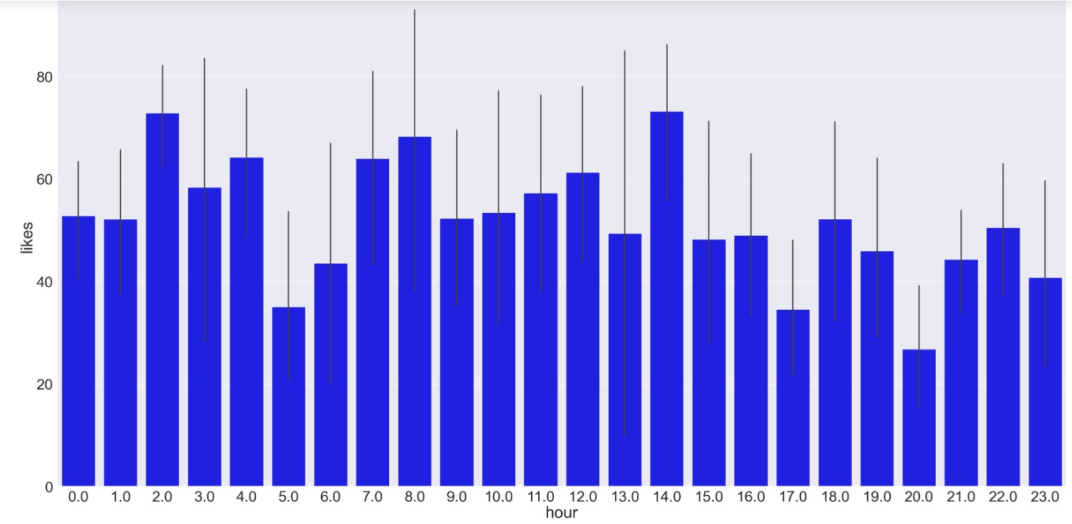
- Likes by Hour: Create a bar chart where the x-axis shows the hours of the day (1-24) and the y-axis shows the average number of likes (blue bars) received for each hour.
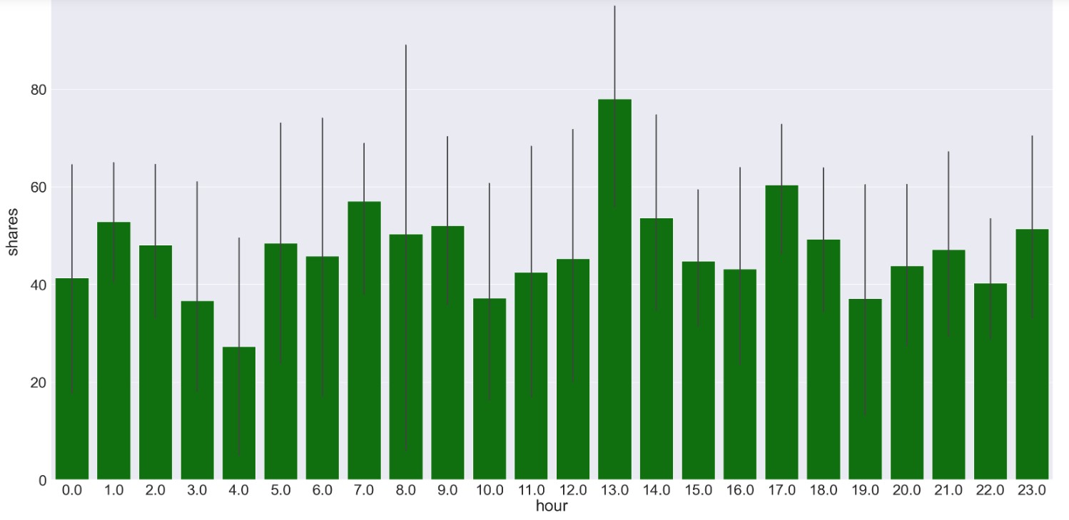
- Shares by Hour: Repeat step 4 for the number of shares (green bars).
- Shares by Day: Set the background of the chart to white and create a bar chart where the x-axis shows the days of the month (1-31) and the y-axis shows the average number of shares (black bars)received for each day.
In short, this code helps you see how the number of likes and shares for Facebook posts change throughout the day and across different days.
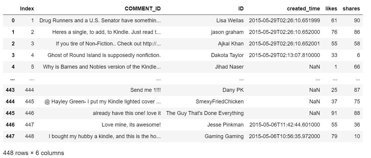
Read and View the Facebook Posts Dataset
import matplotlib.pyplot as plt
import seaborn as sns
import numpy as np
import pandas as pd

df = pd.read_csv(r"data/fb_comments_metrics.csv", encoding ="latin-1")
'''
`r` prefix preceding a string literal denotes a raw string literal.
Specifically, backslashes (\) are treated as literal characters, and are not
used for escaping special characters like they are in regular string literals.
'''
# set figure size and font size
sns.set(rc={'figure.figsize':(40,20)})
sns.set(font_scale=3)
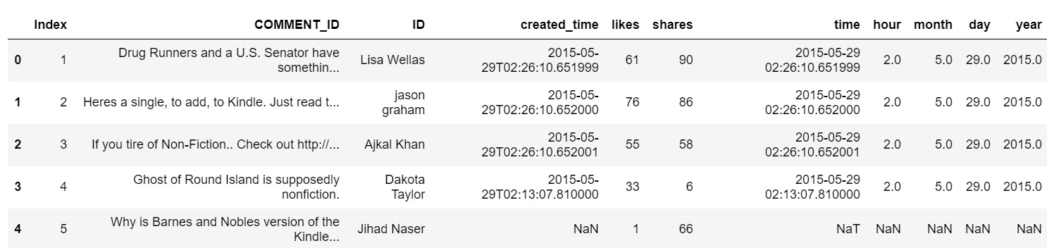
Add Fields to separate out time by Hour, Day, Month and Year
# Separating time by Hour, Day, Month and Year for further analysis using datetime package
import datetime as dt
'''
A lambda function is a small anonymous function that can take any number of arguments, but can only have one expression.
e.g.:
lambda x: x.hour
paramter: x
expression: x.hour ... converts time in datetime format to hour and returns hour
'''
df['time'] = pd.to_datetime(df['created_time'])
df['hour'] = df['time'].apply(lambda x: x.hour)
df['month'] = df['time'].apply(lambda x: x.month)
df['day'] = df['time'].apply(lambda x: x.day)
df['year'] = df['time'].apply(lambda x: x.year)
df.head()
Bar Plot of Likes by Hour
# set x labels
x_labels = df.hour

#create bar plot
sns.barplot(x=x_labels, y=df.likes, color="blue")

# display the plot
plt.show()

# only show x-axis labels for Jan 1 of every other year
# tick_positions = np.arange(10, len(x_labels), step=24)
Bar Plot of Shares by Hour
#create bar plot
sns.barplot(x=x_labels, y=df.shares, color="green")

# display the plot
plt.show()
Bar Plot of Shares by Day
# Set the background color to white
sns.set_style(rc = {'axes.facecolor': 'white'})

#create bar plot
sns.barplot(x=df.day, y=df.shares, color="black")

# display the plot
plt.show()
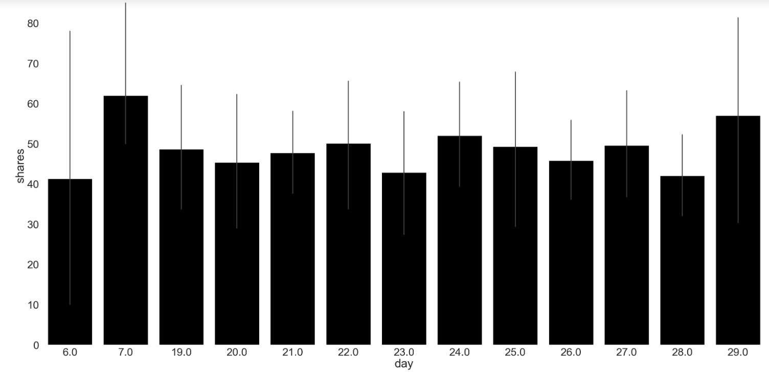
Exhibit 25.22 Seaborn visualization of time series: This analysis of the likes and share of Facebook posts demonstrates how to generate bar plots of the metrics using Seaborn. Jupyter notebook.
Previous Next
Use the Search Bar to find content on MarketingMind.


Contact | Privacy Statement | Disclaimer: Opinions and views expressed on www.ashokcharan.com are the author’s personal views, and do not represent the official views of the National University of Singapore (NUS) or the NUS Business School | © Copyright 2013-2026 www.ashokcharan.com. All Rights Reserved.