
-
Social Media Analytics
Social Media Analytics
Why Social Media Matters for Brands
Insights Gleaned from Social Media Platforms
Strengths of Social Media Data
Limitations of Social Media Data
Understanding Social Data
Social Media Platforms: Key Features
Structured and Unstructured-Data
Social Data Mining
Social Data Mining Process
Social Data Mining Techniques
Social Data Mining Challenges
Application Programming Interfaces
How APIs Work
Working with APIs
Endpoints
Twitter (X) API
Twitter (X) API — Securing Access
Twitter (X) REST API in Python
Facebook API
Facebook Graph API
Facebook API — Securing Access
Facebook API in Python
Advantages and Limitations of APIs
Data Cleaning Techniques
Natural Language Processing
Natural Language Toolkit (NLTK)
Social Media Data Types
Textual Data Encoding
Text Processing Techniques
Tokenization
Word Tokenization
Character Tokenization
Sub-Word Tokenization
Stemming and Lemmatization
Stemming
Lemmatization
Stemming and Lemmatization in Python
N-grams, Bigrams, and Trigrams
Applications of N-grams
Applications of N-grams in Sentiment Analysis
Topic Modelling with N-grams
Vectorization
Bag-of-Words
TF-IDF Vectorizer
Facebook Brand Page Analysis
Extracting Insights from Facebook Brand Pages
Facebook — Social Data Analysis Process
Facebook — Data Extraction
Text Analytics
Text Analytics Process
Part of Speech (POS) Tagging
Noun Phrases
Text Data Processing in Python
Word Cloud (FB data) in Python
Time Series Analysis and Visualization of FB Comments
Emotion Analysis
IBM Watson Natural Language Understanding
Accessing IBM Cloud Services
Emotion Analysis Using Watson NLU
Sentiment Analysis
Forms of Sentiment Analysis
Types of Sentiment Analysis
Visual Sentiment Analysis and Facial Coding
Applications of Facial Coding
Sentiment Analysis in Text
Analysis of Behaviours and Sentiments
Sentiment Analysis Process
Sentiment Analysis — Classification
VADER Classifier
Standard Sentiment Analysis
Customised Sentiment Analysis
Model Validation – Confusion Matrix
K-fold Cross-validation
Named Entity Recognition (NER)
NER Process Overview
Stanford NER
Challenges in NER
Stanford NER Implementation in Python
Web Scraping
Web Scraping Techniques
Applications of Web Scraping
Legal and Ethical Considerations
Beautiful Soup
Scraping Quotes to Scrape
Scraping of Fake Jobs Webpage
Scrapy
Scrapy Concepts
Scrapy Framework
Scrapy Limitations
Beautiful Soup vs. Scrapy — A Comparison
Selenium
Topic Modelling
Topic Modelling — Illustration
Topic Modelling Techniques
Topic Modelling Process
Latent Dirichlet Allocation (LDA) Model
Topic Modelling Tweets with LDA in Python
Social Influence on Social Media
Key Forms of Social Influence
Social Influence on Social Media Platforms
Examples of Organized Social Influence
Social Network Analysis
Topic Networks and User Networks
Online Social Networks — The Basics
Analysing Topic Networks
Centrality Measures
Degree Centrality
Betweenness Centrality
Closeness Centrality
Eigenvector Centrality
Use Case — Marketing Analytics Topic Network
Social Network Analysis Process
SNA — Uncovering User Communities
Appendix — Python Basics: Tutorial
Installation — Anaconda, Jupyter and Python
Python Syntax
Variables
Data Types
If Else Statement
While and For Loops
Functions (def)
Lambda Functions
Modules
JSON
Python Requests — get(), json()
User Input
Exercises
Appendix — Python Pandas
Basic Usage
Reading, Writing and Viewing Data
Data Cleaning
Other Features
Appendix — Python Visualization
Matplotlib
Matplotlib — Basic Plotting
NumPy
Matplotlib — Beyond Lines
Analysis and Visualization of the Iris Dataset
Word Clouds
Word Cloud in Python
Seaborn — Statistical Data Visualization
Seaborn Visualization in Python
Appendix — Scrapy Tutorial
Creating a Project
Writing a Spider
Running the Spider
Extracting Data
Extracting Data — CSS Method
Extracting Data — XPath Method
Extracting Quotes and Authors
Extracting Data in Spider
Storing the Scraped Data
Pipeline
Following Links
Appendix — HTML Basics
HTML Tree Structure, Tags and Attributes
Tags
Attributes
My First Webpage
- New Media
- Digital Marketing
- YouTube
- Social Media Analytics
- SEO
- Search Advertising
- Web Analytics
- Execution
- Case — Prop-GPT
- Marketing Education
- Is Marketing Education Fluffy and Weak?
- How to Choose the Right Marketing Simulator
- Self-Learners: Experiential Learning to Adapt to the New Age of Marketing
- Negotiation Skills Training for Retailers, Marketers, Trade Marketers and Category Managers
- Simulators becoming essential Training Platforms
- What they SHOULD TEACH at Business Schools
- Experiential Learning through Marketing Simulators
-
MarketingMind
Social Media Analytics
Social Media Analytics
Why Social Media Matters for Brands
Insights Gleaned from Social Media Platforms
Strengths of Social Media Data
Limitations of Social Media Data
Understanding Social Data
Social Media Platforms: Key Features
Structured and Unstructured-Data
Social Data Mining
Social Data Mining Process
Social Data Mining Techniques
Social Data Mining Challenges
Application Programming Interfaces
How APIs Work
Working with APIs
Endpoints
Twitter (X) API
Twitter (X) API — Securing Access
Twitter (X) REST API in Python
Facebook API
Facebook Graph API
Facebook API — Securing Access
Facebook API in Python
Advantages and Limitations of APIs
Data Cleaning Techniques
Natural Language Processing
Natural Language Toolkit (NLTK)
Social Media Data Types
Textual Data Encoding
Text Processing Techniques
Tokenization
Word Tokenization
Character Tokenization
Sub-Word Tokenization
Stemming and Lemmatization
Stemming
Lemmatization
Stemming and Lemmatization in Python
N-grams, Bigrams, and Trigrams
Applications of N-grams
Applications of N-grams in Sentiment Analysis
Topic Modelling with N-grams
Vectorization
Bag-of-Words
TF-IDF Vectorizer
Facebook Brand Page Analysis
Extracting Insights from Facebook Brand Pages
Facebook — Social Data Analysis Process
Facebook — Data Extraction
Text Analytics
Text Analytics Process
Part of Speech (POS) Tagging
Noun Phrases
Text Data Processing in Python
Word Cloud (FB data) in Python
Time Series Analysis and Visualization of FB Comments
Emotion Analysis
IBM Watson Natural Language Understanding
Accessing IBM Cloud Services
Emotion Analysis Using Watson NLU
Sentiment Analysis
Forms of Sentiment Analysis
Types of Sentiment Analysis
Visual Sentiment Analysis and Facial Coding
Applications of Facial Coding
Sentiment Analysis in Text
Analysis of Behaviours and Sentiments
Sentiment Analysis Process
Sentiment Analysis — Classification
VADER Classifier
Standard Sentiment Analysis
Customised Sentiment Analysis
Model Validation – Confusion Matrix
K-fold Cross-validation
Named Entity Recognition (NER)
NER Process Overview
Stanford NER
Challenges in NER
Stanford NER Implementation in Python
Web Scraping
Web Scraping Techniques
Applications of Web Scraping
Legal and Ethical Considerations
Beautiful Soup
Scraping Quotes to Scrape
Scraping of Fake Jobs Webpage
Scrapy
Scrapy Concepts
Scrapy Framework
Scrapy Limitations
Beautiful Soup vs. Scrapy — A Comparison
Selenium
Topic Modelling
Topic Modelling — Illustration
Topic Modelling Techniques
Topic Modelling Process
Latent Dirichlet Allocation (LDA) Model
Topic Modelling Tweets with LDA in Python
Social Influence on Social Media
Key Forms of Social Influence
Social Influence on Social Media Platforms
Examples of Organized Social Influence
Social Network Analysis
Topic Networks and User Networks
Online Social Networks — The Basics
Analysing Topic Networks
Centrality Measures
Degree Centrality
Betweenness Centrality
Closeness Centrality
Eigenvector Centrality
Use Case — Marketing Analytics Topic Network
Social Network Analysis Process
SNA — Uncovering User Communities
Appendix — Python Basics: Tutorial
Installation — Anaconda, Jupyter and Python
Python Syntax
Variables
Data Types
If Else Statement
While and For Loops
Functions (def)
Lambda Functions
Modules
JSON
Python Requests — get(), json()
User Input
Exercises
Appendix — Python Pandas
Basic Usage
Reading, Writing and Viewing Data
Data Cleaning
Other Features
Appendix — Python Visualization
Matplotlib
Matplotlib — Basic Plotting
NumPy
Matplotlib — Beyond Lines
Analysis and Visualization of the Iris Dataset
Word Clouds
Word Cloud in Python
Seaborn — Statistical Data Visualization
Seaborn Visualization in Python
Appendix — Scrapy Tutorial
Creating a Project
Writing a Spider
Running the Spider
Extracting Data
Extracting Data — CSS Method
Extracting Data — XPath Method
Extracting Quotes and Authors
Extracting Data in Spider
Storing the Scraped Data
Pipeline
Following Links
Appendix — HTML Basics
HTML Tree Structure, Tags and Attributes
Tags
Attributes
My First Webpage
- New Media
- Digital Marketing
- YouTube
- Social Media Analytics
- SEO
- Search Advertising
- Web Analytics
- Execution
- Case — Prop-GPT
- Marketing Education
- Is Marketing Education Fluffy and Weak?
- How to Choose the Right Marketing Simulator
- Self-Learners: Experiential Learning to Adapt to the New Age of Marketing
- Negotiation Skills Training for Retailers, Marketers, Trade Marketers and Category Managers
- Simulators becoming essential Training Platforms
- What they SHOULD TEACH at Business Schools
- Experiential Learning through Marketing Simulators
Standard Sentiment Analysis
Exhibit 25.27 demonstrates the implementation of sentiment analysis using Python. With a dataset of tweets (tweets.csv, the code processes each tweet in the text column and generates sentiment scores using the VADER SentimentIntensityAnalyzer.
The SentimentIntensityAnalyzer class provides a method called polarity_scores() that takes a piece of text as input and returns a dictionary containing the sentiment scores. This dictionary contains four keys: “neg”, “neu”, “pos”, and “compound”.
The initial visualization presents a summary that shows the count of positive, negative, and neutral tweets in a column chart.
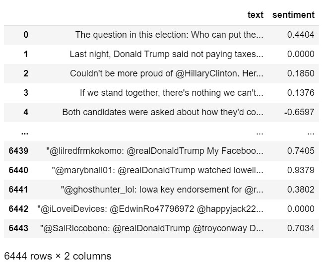
The “compound” score (refer VADER Classifier) in the polarity_scores function represents the overall sentiment polarity of each tweet. It is a single value that encapsulates the compound sentiment score, considering both the positive and negative sentiments expressed in the text.
This score is computed by combining the sentiment scores for individual words in the text. It ranges from -1 to 1, where 1 indicates a highly positive sentiment, -1 indicates a highly negative sentiment, and 0 indicates a neutral sentiment.
The script concludes with a table listing the tweets alongside their compound sentiment scores, allowing you to assess the effectiveness of the VADER algorithm.
Import Libraries and Read the Tweets Data (tweets.csv)
import nltk
nltk.download('vader_lexicon')
from nltk.sentiment.vader import SentimentIntensityAnalyzer
import matplotlib.pyplot as plt
import pandas as pd
# read the tweets and place into dataframe df
df = pd.read_csv("data/tweets.csv")
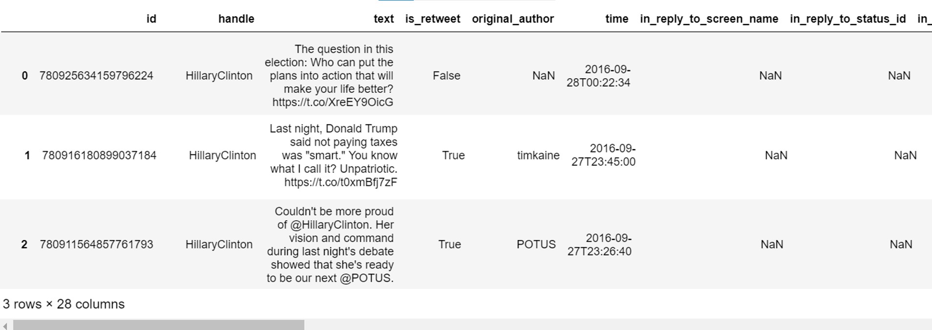
df[:3]
Sentiment Analysis
sentiment = SentimentIntensityAnalyzer()

''' apply sentiment analysis to the text column in df (tweets) and place the
compound polarity scores in a new column - sentiment.'''
df['sentiment'] = df.text.apply(lambda x: sentiment.polarity_scores(x)['compound'])

pos = len(df[df.sentiment > 0]) # count of 'positive' tweets
neg = len(df[df.sentiment < 0]) # count of 'negative' tweets
neu = len(df[df.sentiment == 0]) # count of 'neutral' tweets

y = [pos, neu, neg]	  # vector of y-values
print("positive, neutral, negative: ", y)

# plot of y
plt.title("Sentiment Analysis")
plt.ylabel('Number of tweets')

# the x-axis, range(len(y) is 0, 1, 2. Label these as 'positive', 'neutral', 'negative'
plt.xticks(range(len(y)), ['positive', 'neutral', 'negative'])

# plot a bar chart where the y-axis (height) is y, and the x-axis (0, 1, 2) is labelled 'positive', 'neutral', 'negative'
plt.bar(range(len(y)), height=y, width = 0.75, align = 'center', alpha = 0.8)
plt.show()
positive, neutral, negative: [3272, 1351, 1821]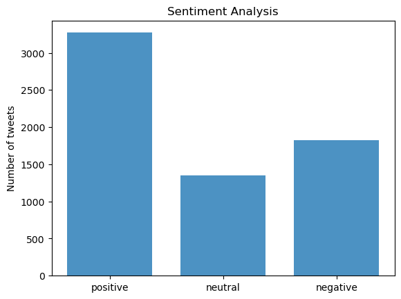
Compound Score
df[['text','sentiment']] # show the columns text and sentiment
Tweets and Compound Sentiment Score
'''Setting 'display.max_colwidth' to None removes any restriction on the column width.
Pandas will display the full content of each cell instead of truncating long text values.
This is particularly useful when working with text-heavy data such as sentiment analysis,
where tweets, reviews, or comments need to be fully visible.'''
pd.set_option('display.max_colwidth', None)
df[['text','sentiment']]
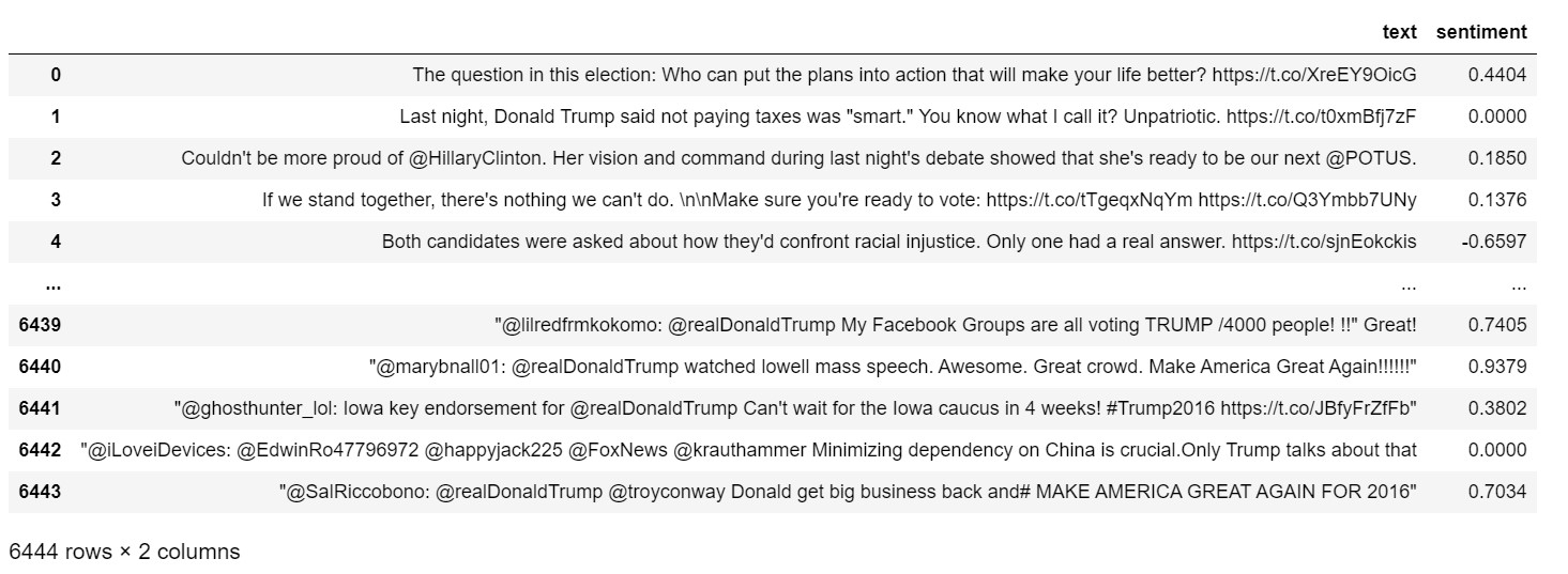
Exhibit 25.27 Sentiment analysis of tweets — Python implementation using VADER SentimentIntensityAnalyzer(). Jupyter notebook.
Previous Next
Use the Search Bar to find content on MarketingMind.


Contact | Privacy Statement | Disclaimer: Opinions and views expressed on www.ashokcharan.com are the author’s personal views, and do not represent the official views of the National University of Singapore (NUS) or the NUS Business School | © Copyright 2013-2026 www.ashokcharan.com. All Rights Reserved.