
-
Social Media Analytics
Social Media Analytics
Why Social Media Matters for Brands
Insights Gleaned from Social Media Platforms
Strengths of Social Media Data
Limitations of Social Media Data
Understanding Social Data
Social Media Platforms: Key Features
Structured and Unstructured-Data
Social Data Mining
Social Data Mining Process
Social Data Mining Techniques
Social Data Mining Challenges
Application Programming Interfaces
How APIs Work
Working with APIs
Endpoints
Twitter (X) API
Twitter (X) API — Securing Access
Twitter (X) REST API in Python
Facebook API
Facebook Graph API
Facebook API — Securing Access
Facebook API in Python
Advantages and Limitations of APIs
Data Cleaning Techniques
Natural Language Processing
Natural Language Toolkit (NLTK)
Social Media Data Types
Textual Data Encoding
Text Processing Techniques
Tokenization
Word Tokenization
Character Tokenization
Sub-Word Tokenization
Stemming and Lemmatization
Stemming
Lemmatization
Stemming and Lemmatization in Python
N-grams, Bigrams, and Trigrams
Applications of N-grams
Applications of N-grams in Sentiment Analysis
Topic Modelling with N-grams
Vectorization
Bag-of-Words
TF-IDF Vectorizer
Facebook Brand Page Analysis
Extracting Insights from Facebook Brand Pages
Facebook — Social Data Analysis Process
Facebook — Data Extraction
Text Analytics
Text Analytics Process
Part of Speech (POS) Tagging
Noun Phrases
Text Data Processing in Python
Word Cloud (FB data) in Python
Time Series Analysis and Visualization of FB Comments
Emotion Analysis
IBM Watson Natural Language Understanding
Accessing IBM Cloud Services
Emotion Analysis Using Watson NLU
Sentiment Analysis
Forms of Sentiment Analysis
Types of Sentiment Analysis
Visual Sentiment Analysis and Facial Coding
Applications of Facial Coding
Sentiment Analysis in Text
Analysis of Behaviours and Sentiments
Sentiment Analysis Process
Sentiment Analysis — Classification
VADER Classifier
Standard Sentiment Analysis
Customised Sentiment Analysis
Model Validation – Confusion Matrix
K-fold Cross-validation
Named Entity Recognition (NER)
NER Process Overview
Stanford NER
Challenges in NER
Stanford NER Implementation in Python
Web Scraping
Web Scraping Techniques
Applications of Web Scraping
Legal and Ethical Considerations
Beautiful Soup
Scraping Quotes to Scrape
Scraping of Fake Jobs Webpage
Scrapy
Scrapy Concepts
Scrapy Framework
Scrapy Limitations
Beautiful Soup vs. Scrapy — A Comparison
Selenium
Topic Modelling
Topic Modelling — Illustration
Topic Modelling Techniques
Topic Modelling Process
Latent Dirichlet Allocation (LDA) Model
Topic Modelling Tweets with LDA in Python
Social Influence on Social Media
Key Forms of Social Influence
Social Influence on Social Media Platforms
Examples of Organized Social Influence
Social Network Analysis
Topic Networks and User Networks
Online Social Networks — The Basics
Analysing Topic Networks
Centrality Measures
Degree Centrality
Betweenness Centrality
Closeness Centrality
Eigenvector Centrality
Use Case — Marketing Analytics Topic Network
Social Network Analysis Process
SNA — Uncovering User Communities
Appendix — Python Basics: Tutorial
Installation — Anaconda, Jupyter and Python
Python Syntax
Variables
Data Types
If Else Statement
While and For Loops
Functions (def)
Lambda Functions
Modules
JSON
Python Requests — get(), json()
User Input
Exercises
Appendix — Python Pandas
Basic Usage
Reading, Writing and Viewing Data
Data Cleaning
Other Features
Appendix — Python Visualization
Matplotlib
Matplotlib — Basic Plotting
NumPy
Matplotlib — Beyond Lines
Analysis and Visualization of the Iris Dataset
Word Clouds
Word Cloud in Python
Seaborn — Statistical Data Visualization
Seaborn Visualization in Python
Appendix — Scrapy Tutorial
Creating a Project
Writing a Spider
Running the Spider
Extracting Data
Extracting Data — CSS Method
Extracting Data — XPath Method
Extracting Quotes and Authors
Extracting Data in Spider
Storing the Scraped Data
Pipeline
Following Links
Appendix — HTML Basics
HTML Tree Structure, Tags and Attributes
Tags
Attributes
My First Webpage
- New Media
- Digital Marketing
- YouTube
- Social Media Analytics
- SEO
- Search Advertising
- Web Analytics
- Execution
- Case — Prop-GPT
- Marketing Education
- Is Marketing Education Fluffy and Weak?
- How to Choose the Right Marketing Simulator
- Self-Learners: Experiential Learning to Adapt to the New Age of Marketing
- Negotiation Skills Training for Retailers, Marketers, Trade Marketers and Category Managers
- Simulators becoming essential Training Platforms
- What they SHOULD TEACH at Business Schools
- Experiential Learning through Marketing Simulators
-
MarketingMind
Social Media Analytics
Social Media Analytics
Why Social Media Matters for Brands
Insights Gleaned from Social Media Platforms
Strengths of Social Media Data
Limitations of Social Media Data
Understanding Social Data
Social Media Platforms: Key Features
Structured and Unstructured-Data
Social Data Mining
Social Data Mining Process
Social Data Mining Techniques
Social Data Mining Challenges
Application Programming Interfaces
How APIs Work
Working with APIs
Endpoints
Twitter (X) API
Twitter (X) API — Securing Access
Twitter (X) REST API in Python
Facebook API
Facebook Graph API
Facebook API — Securing Access
Facebook API in Python
Advantages and Limitations of APIs
Data Cleaning Techniques
Natural Language Processing
Natural Language Toolkit (NLTK)
Social Media Data Types
Textual Data Encoding
Text Processing Techniques
Tokenization
Word Tokenization
Character Tokenization
Sub-Word Tokenization
Stemming and Lemmatization
Stemming
Lemmatization
Stemming and Lemmatization in Python
N-grams, Bigrams, and Trigrams
Applications of N-grams
Applications of N-grams in Sentiment Analysis
Topic Modelling with N-grams
Vectorization
Bag-of-Words
TF-IDF Vectorizer
Facebook Brand Page Analysis
Extracting Insights from Facebook Brand Pages
Facebook — Social Data Analysis Process
Facebook — Data Extraction
Text Analytics
Text Analytics Process
Part of Speech (POS) Tagging
Noun Phrases
Text Data Processing in Python
Word Cloud (FB data) in Python
Time Series Analysis and Visualization of FB Comments
Emotion Analysis
IBM Watson Natural Language Understanding
Accessing IBM Cloud Services
Emotion Analysis Using Watson NLU
Sentiment Analysis
Forms of Sentiment Analysis
Types of Sentiment Analysis
Visual Sentiment Analysis and Facial Coding
Applications of Facial Coding
Sentiment Analysis in Text
Analysis of Behaviours and Sentiments
Sentiment Analysis Process
Sentiment Analysis — Classification
VADER Classifier
Standard Sentiment Analysis
Customised Sentiment Analysis
Model Validation – Confusion Matrix
K-fold Cross-validation
Named Entity Recognition (NER)
NER Process Overview
Stanford NER
Challenges in NER
Stanford NER Implementation in Python
Web Scraping
Web Scraping Techniques
Applications of Web Scraping
Legal and Ethical Considerations
Beautiful Soup
Scraping Quotes to Scrape
Scraping of Fake Jobs Webpage
Scrapy
Scrapy Concepts
Scrapy Framework
Scrapy Limitations
Beautiful Soup vs. Scrapy — A Comparison
Selenium
Topic Modelling
Topic Modelling — Illustration
Topic Modelling Techniques
Topic Modelling Process
Latent Dirichlet Allocation (LDA) Model
Topic Modelling Tweets with LDA in Python
Social Influence on Social Media
Key Forms of Social Influence
Social Influence on Social Media Platforms
Examples of Organized Social Influence
Social Network Analysis
Topic Networks and User Networks
Online Social Networks — The Basics
Analysing Topic Networks
Centrality Measures
Degree Centrality
Betweenness Centrality
Closeness Centrality
Eigenvector Centrality
Use Case — Marketing Analytics Topic Network
Social Network Analysis Process
SNA — Uncovering User Communities
Appendix — Python Basics: Tutorial
Installation — Anaconda, Jupyter and Python
Python Syntax
Variables
Data Types
If Else Statement
While and For Loops
Functions (def)
Lambda Functions
Modules
JSON
Python Requests — get(), json()
User Input
Exercises
Appendix — Python Pandas
Basic Usage
Reading, Writing and Viewing Data
Data Cleaning
Other Features
Appendix — Python Visualization
Matplotlib
Matplotlib — Basic Plotting
NumPy
Matplotlib — Beyond Lines
Analysis and Visualization of the Iris Dataset
Word Clouds
Word Cloud in Python
Seaborn — Statistical Data Visualization
Seaborn Visualization in Python
Appendix — Scrapy Tutorial
Creating a Project
Writing a Spider
Running the Spider
Extracting Data
Extracting Data — CSS Method
Extracting Data — XPath Method
Extracting Quotes and Authors
Extracting Data in Spider
Storing the Scraped Data
Pipeline
Following Links
Appendix — HTML Basics
HTML Tree Structure, Tags and Attributes
Tags
Attributes
My First Webpage
- New Media
- Digital Marketing
- YouTube
- Social Media Analytics
- SEO
- Search Advertising
- Web Analytics
- Execution
- Case — Prop-GPT
- Marketing Education
- Is Marketing Education Fluffy and Weak?
- How to Choose the Right Marketing Simulator
- Self-Learners: Experiential Learning to Adapt to the New Age of Marketing
- Negotiation Skills Training for Retailers, Marketers, Trade Marketers and Category Managers
- Simulators becoming essential Training Platforms
- What they SHOULD TEACH at Business Schools
- Experiential Learning through Marketing Simulators
Seaborn Visualization in Python
Exhibit 25.61 provides the Python code for the statistical analysis and visualization of the tips.csv dataset which contains information about tips given in a restaurant, including total bill, tip amount, gender of the payer, whether the payer is a smoker, day of the week, time of day, size of the party, and the table number. The Tips dataset is included in the seaborn library and is sourced from github. A complete list of seaborn datasets such as tips can be obtained via this code: print(sns.get_dataset_names()).
Here are relevant details of the charts in the Seaborn visualization code:
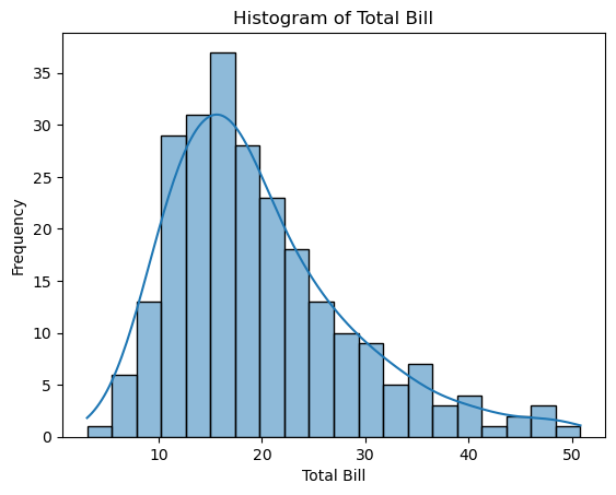
Histogram and Continuous Probability Density Function
Kernel Density Estimation (KDE) is a method for estimating the probability density function (PDF) of a continuous variable. When the kde=True parameter is used in Seaborn, the plot not only displays the histogram bars but also fits a continuous PDF estimated using KDE.
The KDE curve adds valuable insight into the underlying data distribution. It provides a smoother visualization of the data’s overall shape, peaks, and variations compared to a traditional histogram.
By default, Seaborn’s histplot function uses Gaussian kernels for KDE estimation, though you can change the kernel type using the kernel parameter.
Gaussian kernels, also known as normal kernels, are centered around each data point and follow a bell-shaped curve. These kernels are defined by the Gaussian probability density function:
\( f(x) = \frac{1}{\sqrt{2\pi\sigma^2}} e^{-\frac{(x-\mu)^2}{2\sigma^2}} \)
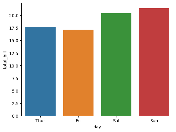
Bar Plot
In a Seaborn bar plot, the vertical lines often represent error bars, which graphically depict the variability or uncertainty of a data point or group of data points. By default, Seaborn uses errorbar="bootstrapped", which calculates the 95% confidence interval using bootstrapping. Alternatively, you can use "sd" for standard deviation or "SEM" for the standard error of the mean.
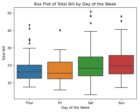
Box Plot
A box plot visualizes the distribution of a dataset using quartiles, making it easy to identify the median, data spread, and potential outliers. Key components of a Seaborn box plot include:
- Box: Represents the interquartile range (IQR), covering the range between the first quartile (25th percentile) and the third quartile (75th percentile), containing 50% of the data. The line inside the box marks the median (50th percentile).
- Whiskers: Extend from the box to the minimum and maximum values within a specified range from the quartiles, typically 1.5 times the IQR by default. Values beyond this range are considered outliers and plotted individually.
- Outliers: Data points beyond the whiskers, plotted as individual dots, indicating significant deviations from the rest of the data.
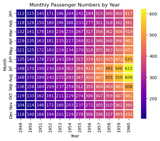
Heatmap
Matplotlib provides several colormaps (cmap) commonly used in Seaborn heatmaps:
- Sequential Colormaps: Gradually change in lightness and saturation, often from low to high. Examples: viridis, plasma, inferno, magma, cividis, rocket, mako, YlGnBu, Greens.
- Diverging Colormaps: Feature a central color that changes in lightness and saturation in two directions. Examples: RdBu, coolwarm, bwr, seismic.
- Qualitative Colormaps: Vary rapidly in color with no specific sequence or order. Examples: tab10, tab20, tab20b, tab20c.
- Miscellaneous Colormaps: Colormaps that don’t fit well into other categories. Examples: binary, gray, gist_earth, ocean, cubehelix.
Tips Dataset
import seaborn as sns
import matplotlib.pyplot as plt

# Load tips dataset and view top/bottom 5 records
tips = sns.load_dataset("tips")
print(tips)
  total_bill   tip     sex smoker   day    time  size
0         16.99  1.01  Female     No   Sun  Dinner     2
1         10.34  1.66    Male     No   Sun  Dinner     3
2         21.01  3.50    Male     No   Sun  Dinner     3
3         23.68  3.31    Male     No   Sun  Dinner     2
4         24.59  3.61  Female     No   Sun  Dinner     4
..          ...   ...     ...    ...   ...     ...   ...
239       29.03  5.92    Male     No   Sat  Dinner     3
240       27.18  2.00  Female    Yes   Sat  Dinner     2
241       22.67  2.00    Male    Yes   Sat  Dinner     2
242       17.82  1.75    Male     No   Sat  Dinner     2
243       18.78  3.00  Female     No  Thur  Dinner     2

[244 rows x 7 columns]
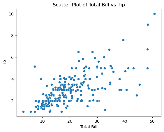
Scatter Plot
# 1: Scatter Plot to visually examine the relationship between total_bill and tip
sns.scatterplot(x="total_bill", y="tip", data=tips)

# Add labels and title
plt.xlabel("Total Bill")
plt.ylabel("Tip")
plt.title("Scatter Plot of Total Bill vs Tip")

# Show plot
plt.show()
Histogram
# 2: Histogram
sns.histplot(tips["total_bill"], bins=20, kde=True)

# Add labels and title
plt.xlabel("Total Bill")
plt.ylabel("Frequency")
plt.title("Histogram of Total Bill")

# Show plot
plt.show()
Bar Plot
# 3: Bar plot
sns.barplot(x="day", y="total_bill", data=tips)

# Add labels and title
plt.xlabel("Day of the Week")
plt.ylabel("Total Bill")
plt.title("Average Total Bill by Day of the Week")

# Show plot
plt.show()

'''
In a Seaborn bar plot, the vertical lines typically represent error bars. Error bars are graphical
representations of the variability or uncertainty in a data point or group of data points.
By default, errorbar="bootstrapped" is used, which calculates the 95% confidence interval using bootstrapping.
Alternatively "sd" is used for standard deviation or "SEM" for standard error of the mean.
To disable error bars set errorbar=None.
'''
# sns.barplot(x="day", y="total_bill", data=tips, errorbar="sd")
sns.barplot(x="day", y="total_bill", data=tips, errorbar=None)
Box Plot
# 4: Box plot
sns.boxplot(x="day", y="total_bill", data=tips)

# Add labels and title
plt.xlabel("Day of the Week")
plt.ylabel("Total Bill")
plt.title("Box Plot of Total Bill by Day of the Week")

# Show plot
plt.show()
Heatmap
# 5: Heatmap

# Load the flights dataset
flights = sns.load_dataset("flights")
'''
Flights Dataset:
URL: https://github.com/mwaskom/seaborn-data/blob/master/flights.csv
Description: The "flights" dataset contains information about the number of passengers on flights for each month
from 1949 to 1960.
'''
print("1) Flights data:\n", flights)

# pivot the data for the heatmap and save the pivot table in dataframe flights_pivot
flights_pivot = flights.pivot_table(
    index="month", columns="year", values="passengers"
)
print("\n2) Pivot table:\n", flights_pivot)

# Create the heatmap using cmap="YlGnBu"
sns.heatmap(flights_pivot,
            annot=True,
            fmt=".0f",
            cmap="plasma",
            linewidths=1)

# Customize the plot (optional)
plt.title("Monthly Passenger Numbers by Year")
plt.xlabel("Year")
plt.ylabel("Month")
print("\n3) Heatmap:")
plt.show()
1) Flights data:
      year month  passengers
0    1949   Jan         112
1    1949   Feb         118
2    1949   Mar         132
3    1949   Apr         129
4    1949   May         121
..    ...   ...         ...
139  1960   Aug         606
140  1960   Sep         508
141  1960   Oct         461
142  1960   Nov         390
143  1960   Dec         432

[144 rows x 3 columns]

2) Pivot table:
 year   1949  1950  1951  1952  1953  1954  1955  1956  1957  1958  1959  1960
month
Jan     112   115   145   171   196   204   242   284   315   340   360   417
Feb     118   126   150   180   196   188   233   277   301   318   342   391
Mar     132   141   178   193   236   235   267   317   356   362   406   419
Apr     129   135   163   181   235   227   269   313   348   348   396   461
May     121   125   172   183   229   234   270   318   355   363   420   472
Jun     135   149   178   218   243   264   315   374   422   435   472   535
Jul     148   170   199   230   264   302   364   413   465   491   548   622
Aug     148   170   199   242   272   293   347   405   467   505   559   606
Sep     136   158   184   209   237   259   312   355   404   404   463   508
Oct     119   133   162   191   211   229   274   306   347   359   407   461
Nov     104   114   146   172   180   203   237   271   305   310   362   390
Dec     118   140   166   194   201   229   278   306   336   337   405   432

3) Heatmap:
Seaborn Datasets
print(sns.get_dataset_names())
['anagrams', 'anscombe', 'attention', 'brain_networks', 'car_crashes', 'diamonds', 'dots', 'dowjones', 'exercise', 'flights', 'fmri', 'geyser', 'glue', 'healthexp', 'iris', 'mpg', 'penguins', 'planets', 'seaice', 'taxis', 'tips', 'titanic', 'anagrams', 'anagrams', 'anscombe', 'anscombe', 'attention', 'attention', 'brain_networks', 'brain_networks', 'car_crashes', 'car_crashes', 'diamonds', 'diamonds', 'dots', 'dots', 'dowjones', 'dowjones', 'exercise', 'exercise', 'flights', 'flights', 'fmri', 'fmri', 'geyser', 'geyser', 'glue', 'glue', 'healthexp', 'healthexp', 'iris', 'iris', 'mpg', 'mpg', 'penguins', 'penguins', 'planets', 'planets', 'seaice', 'seaice', 'taxis', 'taxis', 'tips', 'tips', 'titanic', 'titanic', 'anagrams', 'anscombe', 'attention', 'brain_networks', 'car_crashes', 'diamonds', 'dots', 'dowjones', 'exercise', 'flights', 'fmri', 'geyser', 'glue', 'healthexp', 'iris', 'mpg', 'penguins', 'planets', 'seaice', 'taxis', 'tips', 'titanic']
Exhibit 25.61 Python code for the statistical analysis and visualization of the tips.csv dataset using the Seaborn library. Jupyter notebook
Previous Next
Use the Search Bar to find content on MarketingMind.


Contact | Privacy Statement | Disclaimer: Opinions and views expressed on www.ashokcharan.com are the author’s personal views, and do not represent the official views of the National University of Singapore (NUS) or the NUS Business School | © Copyright 2013-2026 www.ashokcharan.com. All Rights Reserved.